温馨提醒:本文最后更新于2022年12月21日,部分网盘链接偶尔抽风,下载地址如有失效,请在文章评论区留言或者请私信老刘反馈。
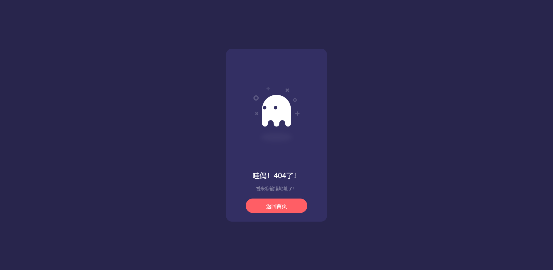
效果:
代码
<!doctype html>
<html>
<head>
<meta charset="utf-8">
<title>没找到您要访问的页面</title>
<script type="text/javascript" src="这里填写你的JS文件目录"></script>
<style>
html, body {
background: #28254C;
font-family: 'Ubuntu';
}
* {
box-sizing: border-box;
}
.box {
width: 350px;
height: 100%;
max-height: 600px;
min-height: 450px;
background: #332F63;
border-radius: 20px;
position: absolute;
left: 50%;
top: 50%;
transform: translate(-50%, -50%);
padding: 30px 50px;
}
.box .box__ghost {
padding: 15px 25px 25px;
position: absolute;
left: 50%;
top: 30%;
transform: translate(-50%, -30%);
}
.box .box__ghost .symbol:nth-child(1) {
opacity: .2;
animation: shine 4s ease-in-out 3s infinite;
}
.box .box__ghost .symbol:nth-child(1):before, .box .box__ghost .symbol:nth-child(1):after {
content: '';
width: 12px;
height: 4px;
background: #fff;
position: absolute;
border-radius: 5px;
bottom: 65px;
left: 0;
}
.box .box__ghost .symbol:nth-child(1):before {
transform: rotate(45deg);
}
.box .box__ghost .symbol:nth-child(1):after {
transform: rotate(-45deg);
}
.box .box__ghost .symbol:nth-child(2) {
position: absolute;
left: -5px;
top: 30px;
height: 18px;
width: 18px;
border: 4px solid;
border-radius: 50%;
border-color: #fff;
opacity: .2;
animation: shine 4s ease-in-out 1.3s infinite;
}
.box .box__ghost .symbol:nth-child(3) {
opacity: .2;
animation: shine 3s ease-in-out .5s infinite;
}
.box .box__ghost .symbol:nth-child(3):before, .box .box__ghost .symbol:nth-child(3):after {
content: '';
width: 12px;
height: 4px;
background: #fff;
position: absolute;
border-radius: 5px;
top: 5px;
left: 40px;
}
.box .box__ghost .symbol:nth-child(3):before {
transform: rotate(90deg);
}
.box .box__ghost .symbol:nth-child(3):after {
transform: rotate(180deg);
}
.box .box__ghost .symbol:nth-child(4) {
opacity: .2;
animation: shine 6s ease-in-out 1.6s infinite;
}
.box .box__ghost .symbol:nth-child(4):before, .box .box__ghost .symbol:nth-child(4):after {
content: '';
width: 15px;
height: 4px;
background: #fff;
position: absolute;
border-radius: 5px;
top: 10px;
right: 30px;
}
.box .box__ghost .symbol:nth-child(4):before {
transform: rotate(45deg);
}
.box .box__ghost .symbol:nth-child(4):after {
transform: rotate(-45deg);
}
.box .box__ghost .symbol:nth-child(5) {
position: absolute;
right: 5px;
top: 40px;
height: 12px;
width: 12px;
border: 3px solid;
border-radius: 50%;
border-color: #fff;
opacity: .2;
animation: shine 1.7s ease-in-out 7s infinite;
}
.box .box__ghost .symbol:nth-child(6) {
opacity: .2;
animation: shine 2s ease-in-out 6s infinite;
}
.box .box__ghost .symbol:nth-child(6):before, .box .box__ghost .symbol:nth-child(6):after {
content: '';
width: 15px;
height: 4px;
background: #fff;
position: absolute;
border-radius: 5px;
bottom: 65px;
right: -5px;
}
.box .box__ghost .symbol:nth-child(6):before {
transform: rotate(90deg);
}
.box .box__ghost .symbol:nth-child(6):after {
transform: rotate(180deg);
}
.box .box__ghost .box__ghost-container {
background: #fff;
width: 100px;
height: 100px;
border-radius: 100px 100px 0 0;
position: relative;
margin: 0 auto;
animation: upndown 3s ease-in-out infinite;
}
.box .box__ghost .box__ghost-container .box__ghost-eyes {
position: absolute;
left: 50%;
top: 45%;
height: 12px;
width: 70px;
}
.box .box__ghost .box__ghost-container .box__ghost-eyes .box__eye-left {
width: 12px;
height: 12px;
background: #332F63;
border-radius: 50%;
margin: 0 10px;
position: absolute;
left: 0;
}
.box .box__ghost .box__ghost-container .box__ghost-eyes .box__eye-right {
width: 12px;
height: 12px;
background: #332F63;
border-radius: 50%;
margin: 0 10px;
position: absolute;
right: 0;
}
.box .box__ghost .box__ghost-container .box__ghost-bottom {
display: flex;
position: absolute;
top: 100%;
left: 0;
right: 0;
}
.box .box__ghost .box__ghost-container .box__ghost-bottom div {
flex-grow: 1;
position: relative;
top: -10px;
height: 20px;
border-radius: 100%;
background-color: #fff;
}
.box .box__ghost .box__ghost-container .box__ghost-bottom div:nth-child(2n) {
top: -12px;
margin: 0 -0px;
border-top: 15px solid #332F63;
background: transparent;
}
.box .box__ghost .box__ghost-shadow {
height: 20px;
box-shadow: 0 50px 15px 5px #3B3769;
border-radius: 50%;
margin: 0 auto;
animation: smallnbig 3s ease-in-out infinite;
}
.box .box__description {
position: absolute;
bottom: 30px;
left: 50%;
transform: translateX(-50%);
}
.box .box__description .box__description-container {
color: #fff;
text-align: center;
width: 200px;
font-size: 16px;
margin: 0 auto;
}
.box .box__description .box__description-container .box__description-title {
font-size: 24px;
letter-spacing: .5px;
}
.box .box__description .box__description-container .box__description-text {
color: #8C8AA7;
line-height: 20px;
margin-top: 20px;
}
.box .box__description .box__button {
display: block;
position: relative;
background: #FF5E65;
border: 1px solid transparent;
border-radius: 50px;
height: 50px;
text-align: center;
text-decoration: none;
color: #fff;
line-height: 50px;
font-size: 18px;
padding: 0 70px;
white-space: nowrap;
margin-top: 25px;
transition: background .5s ease;
overflow: hidden;
}
.box .box__description .box__button:before {
content: '';
position: absolute;
width: 20px;
height: 100px;
background: #fff;
bottom: -25px;
left: 0;
border: 2px solid #fff;
transform: translateX(-50px) rotate(45deg);
transition: transform .5s ease;
}
.box .box__description .box__button:hover {
background: transparent;
border-color: #fff;
}
.box .box__description .box__button:hover:before {
transform: translateX(250px) rotate(45deg);
}
@keyframes upndown {
0% {
transform: translateY(5px);
}
50% {
transform: translateY(15px);
}
100% {
transform: translateY(5px);
}
}
@keyframes smallnbig {
0% {
width: 90px;
}
50% {
width: 100px;
}
100% {
width: 90px;
}
}
@keyframes shine {
0% {
opacity: .2;
}
25% {
opacity: .1;
}
50% {
opacity: .2;
}
100% {
opacity: .2;
}
}
</style>
</head>
<body>
<div class="box">
<div class="box__ghost">
<div class="symbol"></div>
<div class="symbol"></div>
<div class="symbol"></div>
<div class="symbol"></div>
<div class="symbol"></div>
<div class="symbol"></div>
<div class="box__ghost-container">
<div class="box__ghost-eyes">
<div class="box__eye-left"></div>
<div class="box__eye-right"></div>
</div>
<div class="box__ghost-bottom">
<div></div>
<div></div>
<div></div>
<div></div>
<div></div>
</div>
</div>
<div class="box__ghost-shadow"></div>
</div>
<div class="box__description">
<div class="box__description-container">
<div class="box__description-title">404错误!</div>
<div class="box__description-text">看来我们找不到你要找的那一页</div>
</div>
<a href="/index.php" class="box__button">返回</a>
</div>
</div>
<script>
//based on https://dribbble.com/shots/3913847-404-page
var pageX = $(document).width();
var pageY = $(document).height();
var mouseY=0;
var mouseX=0;
$(document).mousemove(function( event ) {
//verticalAxis
mouseY = event.pageY;
yAxis = (pageY/2-mouseY)/pageY*300;
//horizontalAxis
mouseX = event.pageX / -pageX;
xAxis = -mouseX * 100 - 100;
$('.box__ghost-eyes').css({ 'transform': 'translate('+ xAxis +'%,-'+ yAxis +'%)' });
//console.log('X: ' + xAxis);
});</script>
</body>
</html>
js文件下载
「点点赞赏,手留余香」
还没有人赞赏,快来当第一个赞赏的人吧!
 给老刘打赏
给老刘打赏
予人玫瑰,手有余香
- 66¥
- 88¥
- 99¥
- 188¥
- 199¥
¥66
版权声明:
1、本站所有文章内容均来源于互联网,我站仅作收集整理,VIP/积分赞助/打赏等费用仅为维持网站正常运转;
2、本站部分文章、图片不代表本站立场,并不代表本站赞同其观点和对其真实性负责;
3、本站一律禁止以任何方式发布或转载任何违法的相关信息,访客发现请向站长举报;
4、本站资源大多存储在云盘,如发现链接失效,请联系我们,我们会第一时间更新;
5、本站分享的高质量高清写真图集,出镜模特均为成年女性正常写真无R18内容,仅限用于摄影爱好者提供素材与鉴赏学习;
6、本站所有文章、图片、资源等均为收集自互联网,版权归原作者所有。仅作为个人学习、研究以及欣赏!请在下载后24小时内删除。共同维护和谐健康的互联网!如果您发现本站上有侵犯您的权益的作品,请与我们取得联系,我们会及时删除或者修改。