温馨提醒:本文最后更新于2023年8月13日,部分网盘链接偶尔抽风,下载地址如有失效,请在文章评论区留言或者请私信老刘反馈。
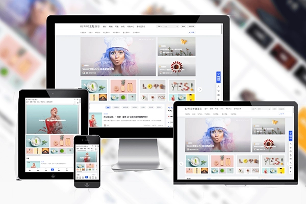
老刘也玩过一段时间的B2主题,收集了一些CSS美化代码,主要是一些简单的美化,如logo扫光,B2菜单美化,H标题美化等等,盘点如下,需要的朋友可拿去。
B2灯箱开启
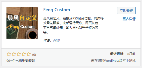
众所周知,B2主题是不带图片灯箱效果的,我们通过一个插件开启,插件名字叫晨风自定义,Wordpress后台就可以搜到
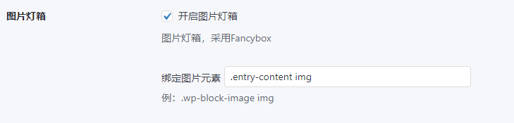
安装后进入插件设置,开启图片灯箱,绑定图片元素填写.entry-content img
也可以用老刘提供的下载链接去下载
下载:https://www.123pan.com/s/PvUrVv-fFxr.html
提取码:A9JV
CSS代码
其中菜单美化,使用方法<span class="meihuabling">我是菜单</span>,配色可自行更改
/*Logo添加闪光效果*/
    .logo {
        position: relative;
        font-size:2em;
        font-weight:700;
        line-height:39px;
        overflow:hidden;
        margin:0;
    }
    .logo::before {
        content:"";
        position: absolute;
        width: 150px;
        height: 10px;
        background-color: rgba(255, 255, 255, .5);
        -webkit-transform: rotate(-45deg);
        transform: rotate(-45deg);
        -webkit-animation: searchLights 1.5s ease-in 1.5s infinite;
        animation: searchLights 1.5s ease-in 1.5s infinite;
    }
    @-webkit-keyframes searchLights {
        0% {
            left: -90px;
            top: 0;
        }
        to {
            left: 90px;
            top: 0;
        }
    }
    /*代码结束*/

#TA-con:hover {
	background-color: #ff3535 !important;
}
#TA-con {
	background-color: #ff5055 !important;
}

.header-banner-left .menu li a i {
	font-size:18px!important
}
/**菜单样式美化代码**/
.has_children .sub-menu {
border-radius: 4px;
}
.top-menu .b2-jt-down {
display: none!important;
}
.top-menu-ul .sub-menu-0 {
border-top: 0;
padding: 15px;
transform: translateY(10px);
transition: all .3s;
}
.top-menu ul li {
}
.top-menu ul li:hover .sub-menu-0 {
transform: translateY(0);
}
.top-menu-ul .sub-menu-0>li {
border-left: 1px solid #ebeef5;
position: relative;
}
.b2-menu-3 .sub-menu-0>li>a {
color: #4c4c4c;
padding: 8px 15px;
white-space:nowrap;
overflow:hidden;
text-overflow:ellipsis;
}
.b2-menu-3 .sub-menu-0>li:after {
content: '';
position: absolute;
top: 12px;
left: -5px;
width: 3px;
height: 3px;
border-radius: 50%;
background: #fff;
border: 3px solid #3d7eff;
}
.b2-menu-3 .sub-menu-0>li:nth-child(2n+1):after{
border: 3px solid #f1787f;
}
.b2-menu-3 .sub-menu-0>li:nth-child(3n+1):after{
border: 3px solid #61e1b9
}
.b2-menu-3 .sub-menu-0>li>a:hover {
background: #ebeef5;
}
.b2-menu-3 .sub-menu-0 > li:hover > a, .b2-menu-3 .sub-menu-0 a:hover {
color: #333;
}

#wpon_svip_gif {
        display: none;
        width: 200px;
        height: 61px;
        border-radius: 0 0 13px 13px;
        z-index: 1002;
        right: 70px;
        top: 200px;
        position: fixed;
    }
/**H标题美化代码**/
.entry-content > h1,
.entry-content > h2,
.entry-content > h3,
.entry-content > h4,
.entry-content > h5
.entry-content > h1 {
font-weight: bold;
background-color: #fff;
margin: 20px 0;
border-bottom: 0px solid red;
padding: 5px 12px;
border-left: 5px solid red;
margin: 12px 0px;
border-radius: 0rem;
}
.entry-content > h2 {
font-weight: bold;
background-color: #fff;
margin: 20px 0;
border-bottom: 0px solid #FF1493;
padding: 1px 10px;
border-left: 5px solid #FF1493;
border-radius: 0rem;
margin: 12px 0px;
}
.entry-content > h3 {
font-weight: bold;
background-color: #fff;
margin: 20px 0;
border-bottom: 0px solid #4169E1;
padding: 1px 10px;
border-left: 5px solid #007bff;
margin: 0px 0px 20px 0px;
border-radius: 0rem;
}
.entry-content > h4 {
font-weight: bold;
background-color: #f6f6f6;
margin: 20px 0;
border-bottom: 0px solid #3CB371;
padding: 5px 12px;
border-left: 5px solid #3CB371;
margin: 12px 0px;
border-radius: 0rem;
}
.entry-content > h5 {
font-weight: bold;
background-color: #f6f6f6;
margin: 20px 0;
border-bottom: 0px solid #FFC0CB;
padding: 5px 12px;
border-left: 5px solid #FFC0CB;
margin: 12px 0px;
border-radius: 0rem;
}
/*菜单文字渐变色*/
.meihua {
background: linear-gradient(90deg, rgba(131, 58, 180, 1) 0%, rgba(253, 29, 29, 1) 33.3%, rgba(252, 176, 69, 1) 66.6%, rgba(131, 58, 180, 1) 100%);
-webkit-background-clip: text;
color: transparent !important;
background-size: 300% 100%;
animation: text 4s infinite linear
}
@media (max-width:768px) {
span.ua-info {
display: none
}
.comment-author .user-title {
width: 40% !important
}
}
.comment-author .user-title {
font-size: 13px;
background: linear-gradient(90deg, rgba(131, 58, 180, 1) 0%, rgba(253, 29, 29, 1) 33.3%, rgba(252, 176, 69, 1) 66.6%, rgba(131, 58, 180, 1) 100%);
-webkit-background-clip: text;
color: transparent !important;
background-size: 300% 100%;
animation: text 4s infinite linear
}
@keyframes text {
0% {
background-position: 0 0
}
100% {
background-position: -150% 0
}
}
.b2-qr-code-fill {
background: linear-gradient(90deg, rgba(131, 58, 180, 1) 0%, rgba(253, 29, 29, 1) 33.3%, rgba(252, 176, 69, 1) 66.6%, rgba(131, 58, 180, 1) 100%);
-webkit-background-clip: text;
color: transparent !important;
background-size: 300% 100%;
animation: text 4s infinite linear
}
/*菜单文字渐变动画*/
.meihuabling {
	background: linear-gradient(90deg, rgba(131, 58, 180, 1) 0%, rgba(253, 29, 29, 1) 33.3%, rgba(252, 176, 69, 1) 66.6%, rgba(131, 58, 180, 1) 100%);
	-webkit-background-clip: text;
	color: transparent !important;
	background-size: 300% 100%;
	animation: text 1s infinite linear
}
@media (max-width:768px) {
	span.ua-info {
		display: none
	}
	.comment-author .user-title {
		width: 40% !important
	}
}
.comment-author .user-title {
	font-size: 13px;
	background: linear-gradient(90deg, rgba(131, 58, 180, 1) 0%, rgba(253, 29, 29, 1) 33.3%, rgba(252, 176, 69, 1) 66.6%, rgba(131, 58, 180, 1) 100%);
	-webkit-background-clip: text;
	color: transparent !important;
	background-size: 300% 100%;
	animation: text 4s infinite linear
}
@keyframes text {
	0% {
		background-position: 0 0
	}
	100% {
		background-position: -150% 0
	}
}
/**侧边悬浮栏二维码颜色**/
.b2-qr-code-fill {
	background: linear-gradient(90deg, rgba(131, 58, 180, 1) 0%, rgba(253, 29, 29, 1) 33.3%, rgba(252, 176, 69, 1) 66.6%, rgba(131, 58, 180, 1) 100%);
	-webkit-background-clip: text;
	color: transparent !important;
	background-size: 300% 100%;
	animation: text 4s infinite linear
}
.b2-weixin {
	background: linear-gradient(90deg, rgba(17, 153, 42, 1) 0%, rgba(56, 184, 125, 1) 33.3%, rgba(82, 194, 52, 1) 66.6%, rgba(30, 184, 7, 1) 100%);

	-webkit-background-clip: text;
	color: transparent !important;
	background-size: 300% 100%;
	animation: text 1s infinite linear
}
/*侧边悬浮栏宽度调整*/
.bar-middle .bar-normal, .bar-footer, .bar-top, .gdd-quick-link-buy-vip {
	width:44px!important;
}7B2主题开心版下载
如果你正好也对B2主题感兴趣,可移步:

「点点赞赏,手留余香」
还没有人赞赏,快来当第一个赞赏的人吧!
 给老刘打赏
给老刘打赏
予人玫瑰,手有余香
- 66¥
- 88¥
- 99¥
- 188¥
- 199¥
¥66
版权声明:
1、本站所有文章内容均来源于互联网,我站仅作收集整理,VIP/积分赞助/打赏等费用仅为维持网站正常运转;
2、本站部分文章、图片不代表本站立场,并不代表本站赞同其观点和对其真实性负责;
3、本站一律禁止以任何方式发布或转载任何违法的相关信息,访客发现请向站长举报;
4、本站资源大多存储在云盘,如发现链接失效,请联系我们,我们会第一时间更新;
5、本站分享的高质量高清写真图集,出镜模特均为成年女性正常写真无R18内容,仅限用于摄影爱好者提供素材与鉴赏学习;
6、本站所有文章、图片、资源等均为收集自互联网,版权归原作者所有。仅作为个人学习、研究以及欣赏!请在下载后24小时内删除。共同维护和谐健康的互联网!如果您发现本站上有侵犯您的权益的作品,请与我们取得联系,我们会及时删除或者修改。